Text
A Text component is a useful way to display static textual information on a page, such as headings, paragraphs, or explanatory notes.
How to add a text component to a page can be found here: Pages
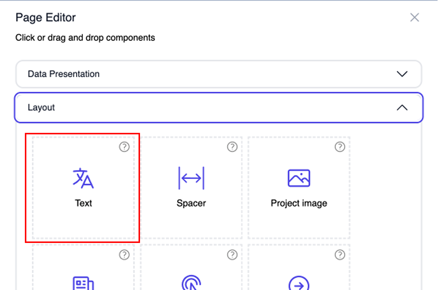
To create a Text component, do the following:
- Click on the page designer.
- Press the
+icon. - Click on the dropdown menu, and select Text under the Layout section.
The component has now been created, but it is empty. Below you will find the available settings to customize your text block.
Component editor
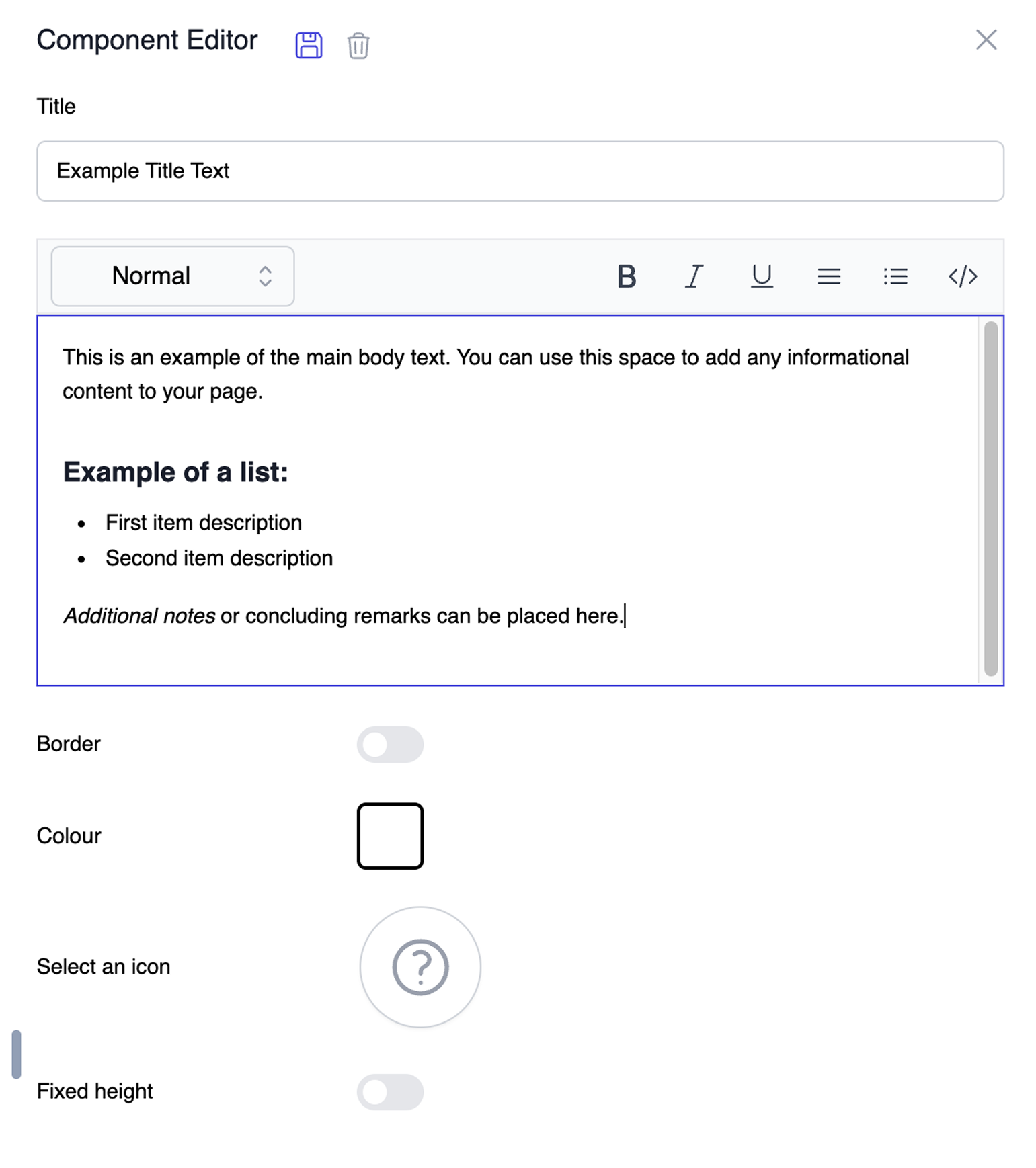
To edit the Text component, click on the edit icon. The Component Editor will open, providing several options to format and style your text block.
Title
The title of the Text component is optional. When set, this title will be shown above the text block on the page.
Content Editor
This is the main text box where you enter your content. It includes a rich-text toolbar that allows you to structure and format your text easily:
- Text format: Change the text from standard 'Normal' text to various heading sizes using the dropdown menu.
- Text style: Format your text to be Bold, Italic, or Underlined.
- Alignment: Align your text (e.g., left, center, or right).
- Lists: Create clear bulleted or numbered lists.
- Source Code (
</>): Toggle the source view to see or directly edit the underlying HTML code of your text (such as<p>,<ul>, or<strong>). This is very useful for advanced users who want precise control over the formatting and layout.
Special options
To make the text block fit the exact design and layout of your page, you can use the following styling options at the bottom of the Component Editor.
Border
A toggle switch that, when enabled, places a visible border around the entire text block to separate it from other components on the page.
Colour
Click on the color square to open a color picker. This allows you to set a specific accent or background color for the component.
Select an icon
Click on the circle containing the question mark to choose an icon from the library. This icon will be displayed alongside your text.
Fixed height
By default, the text component grows based on the amount of text you enter. Enabling the Fixed height toggle restricts the component to a specific height. This value is set in rem units (for example, 15rem). If the entered text exceeds this designated height, a scrollbar will automatically appear, allowing users to scroll through the content.