Components
How to add a component to a page can be found here: Pages
Introduction
Datastorms supports multiple component types, each with its own speciality. The components are split up in four different groupings:
- Data presentation
- Layout
- Actions
- Data visualisation
Any component needing instance data to operate utilizes a query.
Data presentation
These components can be used to present the instance data.
| Component | Description |
|---|---|
| Table | Displays data in a structured, row-and-column format, ideal for presenting lists, figures, or records. |
| Tree | Visualizes hierarchical data, showing parent-child relationships, perfect for organizational structures or categorized items. |
| Map | Integrates interactive geographical maps, allowing users to visualize location-based data or navigate areas. |
| Report | Generates comprehensive summaries or analyses of data, often with charts and graphs, for insights and sharing. |
| Kanban board | Organizes tasks or workflows visually into columns representing different stages, facilitating project management and tracking. |
Layout
These components are used for supporting the page layout.
| Component | Description |
|---|---|
| Text | Displays static text content, ideal for headings, paragraphs, or explanatory notes on a page. |
| Spacer | Creates empty vertical or horizontal space, helping to organize content and improve visual layout. |
| Project image | Showcases an image relevant to the project, such as a logo, banner, or illustrative graphic. |
| News/messages | Presents a dynamic feed of news updates, announcements, or important messages to users. |
| Pages quick links | Provides a convenient list of clickable links to other important pages within the project. |
| Last visited pages | Displays a list of pages recently accessed by the user, enabling quick navigation back to previous views. |
| Dashboard | Shows summaries or counts of certain data inside a project. |
| URLs | Embeds external web links, allowing users to navigate to specific online resources. |
Actions
| Component | Description |
|---|---|
| Import | Facilitates the loading of external data or files into the project, streamlining data ingestion. |
| Workflow | Defines and visualizes a sequence of automated tasks or steps, managing processes from start to finish. |
Data visualisation
| Component | Description |
|---|---|
| Bar Chart | Visualizes data using rectangular bars of varying heights or lengths, ideal for comparing categories or changes over time. |
| Pie Chart | Represents parts of a whole as slices of a circle, illustrating proportions or percentages of a total. |
| Line Diagram | Displays data points connected by lines, perfect for showing trends, changes, or comparisons over a continuous period. |
Component descriptions
To add a section to a page a few steps need to be followed to start with.
- Click on the Page Designer button in the top right corner
- Click on the + button which appears on nearly the same place
- Select the component you want to add
- Click on the edit component button of the component you just added
The editing options for the different components are listed below.
The bigger and more difficult components have their own page or are grouped on a different page. The data presentations have their own pages except the report, and the data visualisation are explained on the chart page.
After you changed sometthing in the component editor save your changes with the save button which is on the right side of the text component editor. All unsaved changes will be lost.
Report
To add a report select the report in the Data Presentation section.
After the section is made you can edit this section and the following menu opens:
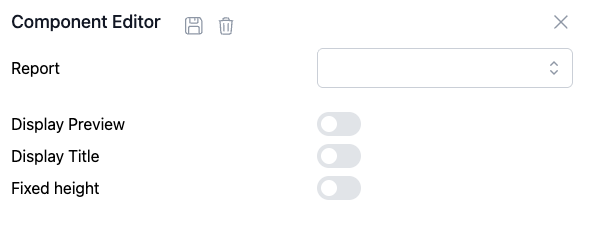
In the area next to the report you can select the report you want to display.
With the other options you can choose whether you want to display a preview of the report. If you want to display a title a textarea opens where you can add the title. If you select the fixed height option a textarea opens where you can insert the desired height of the report.
Spacer
A spacer is a component used to create or maintain a specific distance between other components. It is a blank component and therefore has no edit options.
Project image
When a Project image component is made and the edit component button is clicked the following menu opens:
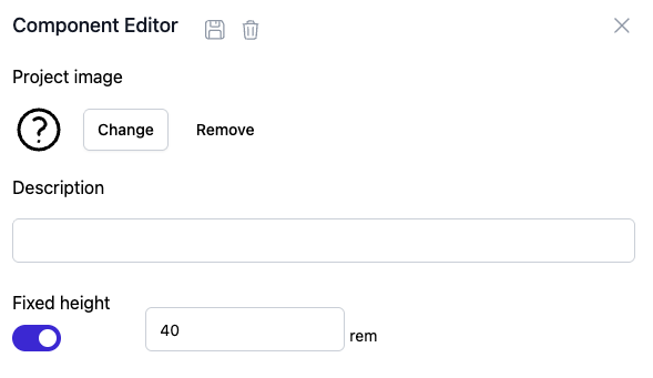
A picture can be added by clicking on the change button. When clicked your file browser opens through which you can select the desired picture. With the remove button a picture can be removed after it is added.
In the section underneath description you can add a description for the picture which will appear in the middle below the picture.
News/messages
When a News/messages component is made and the edit component button is clicked the following menu opens:
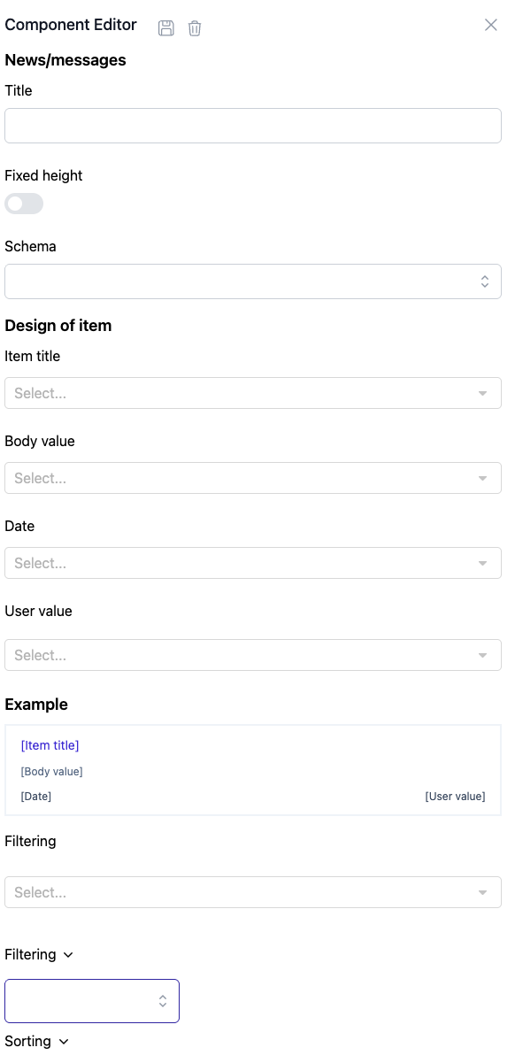
In the title section the title of the whole component can be added.
In the schema section a class can be selected.
In the item title, Body value, Date and User value sections the attributes you want to be shown in the message can be shown.
The messages will be shown as can be seen at example.
You can filter and sort the results shown in those sections on the bottom of the component editor.
Pages quick links
When a pages quick links component is made and the edit component button is clicked the following menu opens:
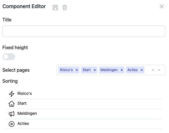
A quick links component can be used to quickly access pages. You can select the pages you want as a quick link in this component in the select pages section. After you added the desired pages you can sort them in the sorting section.
Last visited pages
A last visited pages component displays all the pages you last visited in chronological order from most recent to least recent with a max of ten pages.
The only option available in the component editor is the fixed height option which.
URL's
When an URL component is made and the edit component button is clicked the following menu opens:
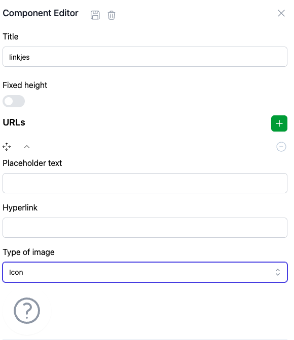
A title and a fixed height can be assigned.
With the + button next to URLs a link can be created.
After this button is clicked a new URL set up is made.
With the placeholder text you can insert the text you want to be shown in the Section.
In the hyperlink section you can insert the link of the site that you want to be opened when the text is clicked.
In the type of image you can choose for an icon which can be chosen by clicking on the question mark seen in the picture above.
The other option is an image. Adding an image works the same as adding the project image section.
Import
When the import section is selected a menu opens in which you can select the desired import. For how to add a new import see the imports page of the manual.
When added, the component shows the selected import and two buttons: download import definition and import.
Workflow
When the workflow section is selected a menu opens in which you can select the desired workflow and the title.
When added, the component shows the title and a run button to run the selected workflow.